
Incorporating Bold Primary Colors Into Your Room
When looking for your next interior design move, incorporating the bold primary colors into your home will give you a stylistic and eclectic aesthetic. Red, yellow and blue are three pigment colors that are pure, therefore they cannot be made by mixing any other colours, but are mixed together to create all other colors. Red and yellow are accountable for providing the warm colours and blue caters for the cooler colors.
The warm primaries (red and yellow) are hues that are said to advance, meaning they appear to come forward and make the walls feel closer. In their true form, primary colors are often associated with childhood, but they can combine within your interior, creating a well established and sophisticated abode.


Primary Colors used in Artwork
These bold primary colors are the foundations for all colours with the help of black and white, encouraging tone and value. Many of the derivatives from primary colors are used more frequently, such as your grays, pinks and neutrals. However, these bold primaries have recently seen a resurgence. Primary colors have a major impact, particularly when they are used together. These rich and vibrant combinations are used in modern art, pop art and comics. You can often see primary colors combined with geometric shapes in modern art such as the abstract “Composition with Red Blue and Yellow” created by Piet Mondrian.

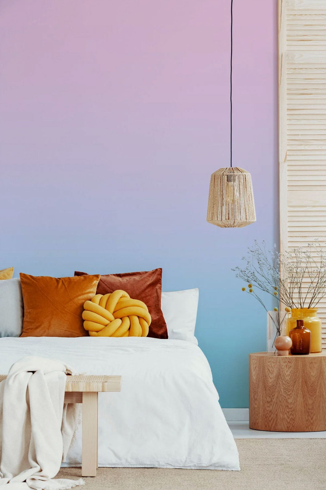
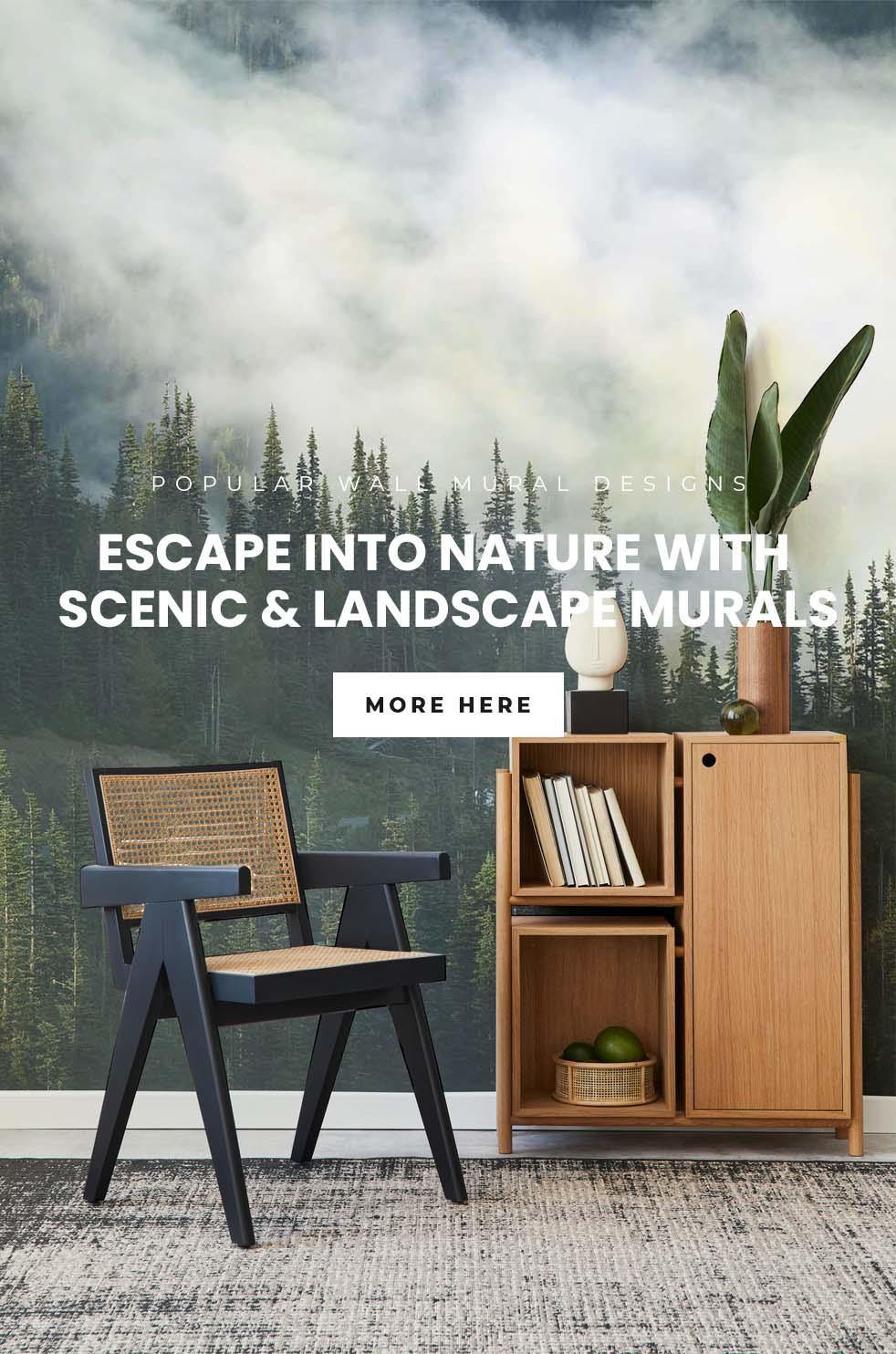
Shop Colorful Ombre & Gradient Murals
Primary Interior Trends for 2021
In interior trends today, primaries can be perfectly suited with richly patterned rugs if you’re feeling a little eccentric and is a great way to incorporate color. Using a room sized rug will bring rich, regal color to a monochromatic living space and pick up the colour throughout. As well as this, bright white and gray tones will create a vibrant and welcoming environment. Both subtleties can create an interior that provokes a true feeling of home. Eazywallz have established that primary colors are an up and coming trend for 2021, so have established some initial primary color designs for all budding interior designers and get your creative juices flowing.

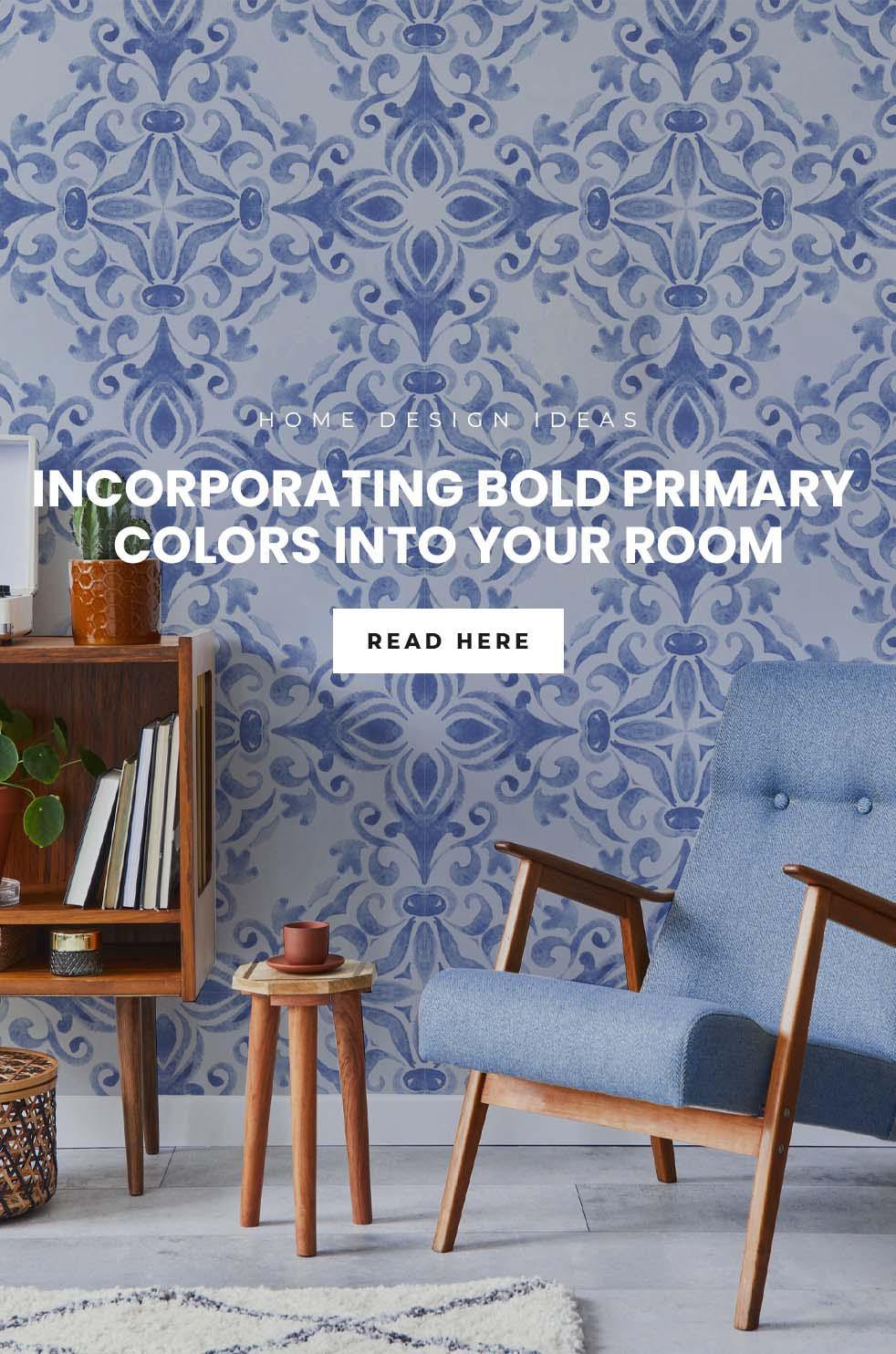
Using the color wheel to choose your color scheme
When looking for a color pattern to follow, many people revert to the color wheel to inspire their colour schemes. The colour wheel is separated into warm and cool colours and displays how colors relate to each other, featuring the complementary relationship between primary, secondary and tertiary colors. Using a colour wheel will help you to develop a color scheme for your next design venture.
These bold primary hues can be used within a room not only as a signature statement wall, but also incorporated in accessories if you want to follow a more neutral palette and still utilize a daring pop of colour. When incorporating the vibrant primary colors into your home try to only use one or two bright hues at one time. This allows you to keep two as their pure hue and mute down the third.

Red isn’t for the faint of heart
Red isn’t for the faint of heart. It is the color of anger, love and passion, allowing the senses to be heightened and create a mood within your living space. Using red on the walls makes the room. Depending on the texture of the room, deep reds can absorb light while brighter primary reds allow for light to bounce off the walls. Red is a beautiful and intense color that can create a serious mood, triggering opposing emotions - anger and danger, passion and love.

If you want a more neutral palette then there is potential to incorporate an earthy red with wood tones to warm up a room , making the room cozy and soft. When integrating red embellishments, why not try some red drapes? When the light beams through your windowpane, it will give the room a soft red glow; or a number of big red chairs for a statement centrepiece.

Blue gives a sense of luxury
Blue is one of the only colors that maintains its own character in all of its tones It has a variety of different shades that can represent a tranquil, yet lavish space. This hue at its core provides an instantly welcoming and calming nature or a touch of drama with a blended color scheme of deep royal blue and gold embellishments.

Blue and white always works together - it’s classic and will never go out of style.
Working with a streamlined palette enables the room to feel cohesive and using the achromatic hues (black, white and gray), helps to provide a resting place for your eyes. If you choose blue, it can evoke tranquility and a calming effect, making it the perfect choice for a bathroom or bedroom.

Our interiors could definitely benefit from a little more relaxation, particularly when many of them have been coupled as a workspaces. If your interior needs a little pick me up decorating with a bright blue, might just stop you feeling so, well… blue
Say Yes to Yellow
Take notes from Panatone’s color of the Year and drench your space in yellow. This sunny and bright primary would create the perfect backdrop using a lovely yellow wallpaper to save painting your walls, and adding red and blue detailing would create an established and dazzling interior design.

Totally chic and ultra modem. Canary yellow has a hint of orange for a deeper, less primary-color feel; retaining the sunniness and positivity of bright yellow. It is sophisticated yet bold - pairing well with whites and grays. Yellow and gray is such a popular color combination in 2021. A neutral grey works well with almost any secondary color, but specifically yellow. Yellow is the ultimate mood booster. It is a cheerful color with a mellow undertone, without being in your face in its boldest form. This primary colour exudes confidence and freshness.

Use yellow to create a fabulous focal point
Use yellow to create a fabulous focal point. Adding yellow decorative features such a yellow fireplace with yellow cushions to a neutral living space. This buttercup yellow fills the room with positive vibes and brings a classic style up to date. Adding white furniture would help to balance this colour. As well as this, there is the option to create a contrast with yellow, by using dark and stormy ocean blue hues. This color contrast adds pizazz; clashing the colors with bright and dark tones. If you were to choose a faded lemon shade and this color was near a natural light and bay window, this color adds a soft glow when the light shines through them.

Shop Yellow Removable Wallpaper
Choosing primary colors for your next home interior design
Using primary colours can be a fabulous way to flaunt your interior design skills. Whether that bold with a radiant red, blue or yellow wall; or small and simple primary color embellishments to make the room striking and sophisticated, yet totally subtle.
If you're looking to dip your toe into the primary pool and add pops of primaries to your home interior contact Eazywallz today!
Read more

Do you want to travel to a destination of your dreams in the comfort of your own home? Take your home to the city you love or the location you’ve always wanted to visit with stunning skyline wallpa...
There are many landscapes around the world that make your heart skip a beat. Images of your favourite place can elicit fond memories or simply make it onto your bucket list of places to visit. Whet...